Catch the burnout before the crash
EmberSense is a student burnout early-detection app for UPLB. I ran the research, mapped every finding to a feature, and built a prototype with two personalities — Gentle and Structured. Then real students tested it, and told me exactly what to fix.
- Role
- Lead UI/UX Designer
- Timeline
- Feb to May 2026
- Team
- Led a team of four
Burnout isn’t a switch, it’s a slide, so I built a tool that notices the slide before the student does, in whichever voice that student can actually hear.
Interviews revealed burnout as a progression students only recognize in hindsight. An affinity diagram sorted that into three arcs and four behavioral personas, some need a gentle nudge, some need hard structure. So EmberSense ships as one app with two personalities. Alpha testers loved the concept but flagged real friction: hidden scheduling, wordy insights, a confusing check-in, an inconsistent mode switch. Every screenshot pair below is a fix I made from a quote they gave me.
Nobody notices burnout while it's happening
I interviewed UPLB students about stress. The pattern was unanimous: they could describe burnout in perfect detail, but only in the past tense.
Every student I interviewed could describe burnout vividly, but almost none could tell me when it started. That gap is the whole problem. Burnout isn’t a bad day; it’s a slow erosion that the person experiencing it is the last to notice. Andrea described “two phases”, she keeps functioning normally until phase two arrives and the floor drops out. Dani’s crashes “come out of nowhere.” They don’t, the signals were there for weeks; nothing was watching for them.
The cruelest part is what I started calling the discipline mask. UPLB students keep performing while they burn internally. One participant put it flatly: “I don’t care about motivation. I just know I have to submit.” Grades hold steady. Deadlines get met. So every metric a school actually tracks says the student is fine, right up until they aren’t.
If the signal you can measure only appears after the damage is done, you’re not detecting burnout. You’re confirming it.
Andrea’s “two phases”, overwhelm when deadlines and org duties collide. r = .85 with burnout.
“Cynical about studies”, emotionally numb, stops replying to messages.
Missed deadlines, but only in phase two. Discipline hides this until last.
Emotional exhaustion and perceived stress lead, but sleep signals cluster right behind them, and sleep is passively measurable. That became the spine of the detection model.
Three arcs, and four people who live them differently
Every interview note went on a wall. Clustered, they told one story in three acts.
I ran contextual inquiries and semi-structured interviews with 12 UPLB students, deliberately skewed toward the people most at risk: first-years still finding their footing, graduate students, working students, and student-athletes and performers. My teammates helped run interviews; I owned the synthesis from there.
I coded every transcript onto an affinity diagram, and the same shape kept surfacing from completely different lives: stress that recovers after a break is normal; stress that doesn’t is the tell. Bianca traced her better semester entirely to actually resting over Christmas. Others described breaks that changed nothing. That single distinction, recovery vs. non-recovery, became the backbone of the whole detection model.
Coursework + orgs + invisible study time stack. Org duty is a stress multiplier equal to academics.
Skipped meals, palpitations, weekend over-sleep, then avoidance and numbness, subtle, easy to miss.
Doomscrolling, naps, sweets, temporary relief that desensitizes. They want insight, not another chore.
The gap wasn’t willpower. It was self-awareness and timing, students miss the tipping point until their coping fails. So the design problem became: surface the slide early, without adding load.
I refused to cluster by year level or program, that tells you nothing about how someone copes. I clustered by behavior: stress response, coping strategy, self-awareness, and openness to digital tools. Two students in the same course can need opposite things. These four archetypes are what the product actually has to serve, and, crucially, they don’t all want to be spoken to the same way.
“I’d like to finish everything without feeling constantly burnt out.”
“I keep every promise to the org, it’s my own tasks that slip.”
“Sometimes I just need to scroll a bit to clear my head before I deal with everything again.”
“I don’t want another app that makes me feel like I’m failing.”
Two personas want structure, two want gentleness. That split is the reason EmberSense has two modes, and why it opens gentle by default, in Nico’s world.
Nico’s fear, “I don’t want another app that makes me feel like I’m failing”, and Dani’s need for structure sit at opposite ends of one axis. A single tone would either overwhelm Nico or underwhelm Dani. That tension is what forced the central design decision later on.
I codified the two voices into a design system
With the two-voice split settled, I turned it into a small system others could build on, without averaging away the thing that made it feel human.
The whole system turns on one mode prop. Almost every component takes it and flips exactly two things, the accent colour and the corner language, so a screen can never quietly forget which voice it’s in. Amber carries warmth; blue carries data; coral flags risk; green marks recovery. Every suggestion the app surfaces is paired with one of fifteen small illustration motifs by a keyword matcher, so advice arrives as a picture, not another line of text.
how are you
holding up?
Regular for reading, medium for emphasis, semibold for headings. The sans stays quiet so the serif can carry the feeling.
Every suggestion the app surfaces is paired with a motif by a small keyword matcher, so “wind down before midnight” or “reach out to someone” arrives with a picture, not just another line of text. Amber carries warmth, blue carries data, coral flags risk.
A detection model with a sense of timing
Before designing screens, I mapped how signals should flow, and when in a semester they matter most.
The tell isn’t a bad week, it’s a week that doesn’t recover after a break. That’s what separates normal stress from burnout, and it’s what the model watches for.
Every feature had to earn its place from a finding
No feature shipped on a hunch. Each one traces back to a quote and forward to a persona — and the app chooses its voice silently.
The personas didn’t just want different features, they wanted to be spoken to differently. So instead of averaging them into something safe and bland, I built one app with two voices, and had it choose silently, from three quiet questions during onboarding, never framed as a personality test. Either voice can be changed later in Settings.
The single ambient signal both modes share. Rather than show a burnout score, the app carries a glowing ember whose warmth and steadiness track your recovery state. It reframes an early-warning system as something you tend, not a grade you’re failing, which is exactly what the discipline-mask problem demanded.
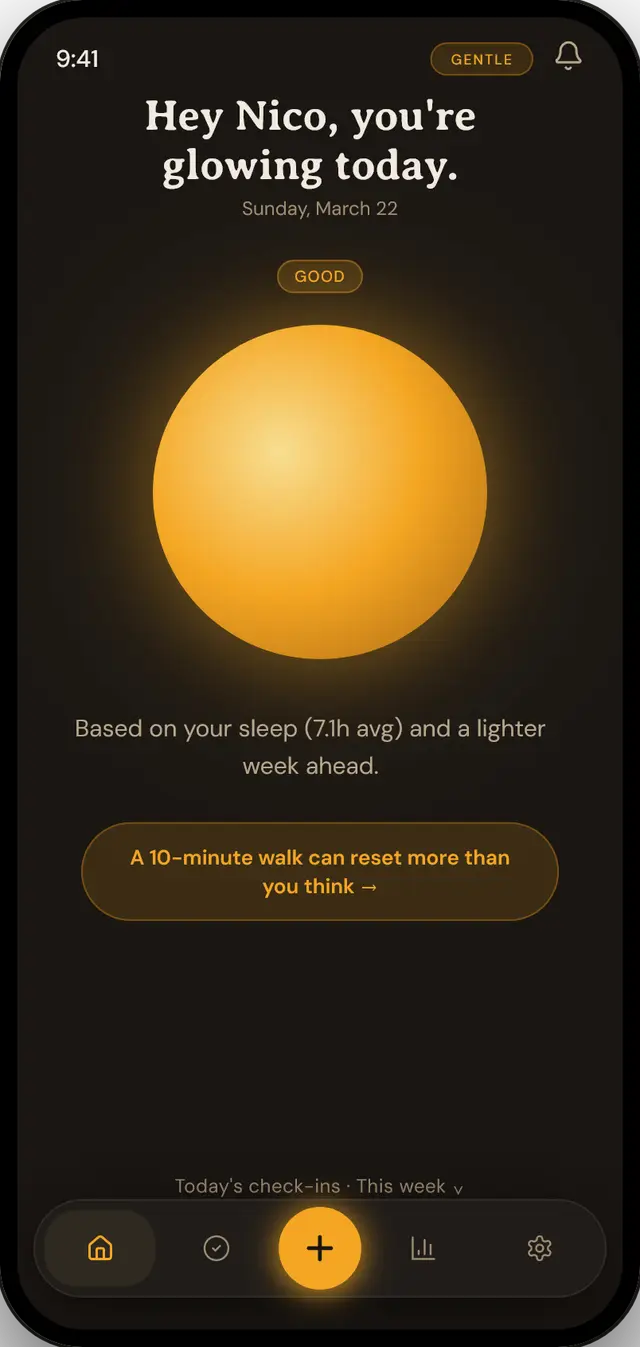
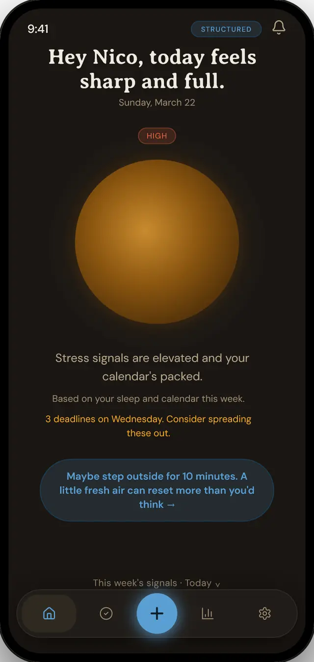
Same risk state, same underlying data. Gentle reassures; Structured briefs. This is the bet alpha testing put to the test.
The prototype, live and in your hands
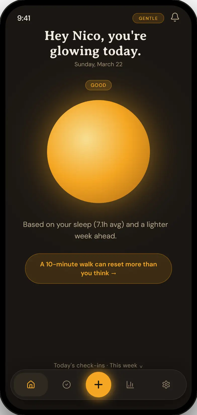
This is the real, current build — not a picture of it. Check in, add a task, open Insights. Then flip Gentle ⇄ Structured in Settings and watch the whole app change its voice.
Then I put it in front of real students
Alpha testers loved the concept and the colours, and were refreshingly blunt about the friction. Every fix below started as something one of them said — toggle each screen.
"There are badge pills on the homepage I don't understand what for, i.e. building, structure."
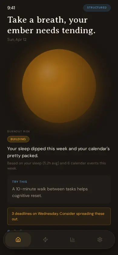
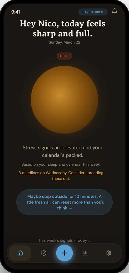
Replaced the ambiguous “BUILDING” pill and dense paragraph with a single clear risk word, a one-line reason, and a greeting that names the user, the ember does the rest.
Before screens are the raw alpha build; after screens are the revised, device-framed version.
The score, and why they picked their side
On the standard System Usability Scale, the revised build landed in the “excellent” band. The favorable side wins every single row.
disagree
agree
“I flip-flop, but I have ADHD, structure works best for me. Straightforward and clearer about what’s happening.”
“It felt like talking to a friend. I have a lot of internal pressure, this didn’t add more just to look at my tasks.”
What I'd carry forward
The dual-mode bet paid off, and the friction testers found was almost entirely about legibility and reach: surface the action, cut the words, make the interaction honest.
Testers self-sorted by temperament exactly as the personas predicted. If I continued, I’d validate the passive-sensing risk model against a full semester of real data, and pressure-test whether the tone can recalibrate itself without ever telling the user it’s doing so.
EmberSense · Human-Computer Interaction research & design · UPLB · Hervé Roldan
Sent — thanks, I'll write back soon.