The form was never the point
Redesigning the campaigns boutique gyms use to win members — the Prize, Membership and Links surfaces. Built on an existing design system as FitForms moved from a $55 form tool to a premium studio platform.
- Role
- UI/UX Designer
- Timeline
- Apr to Jul 2026
- Team
- 1 Product Manager + 1 Designer (me)
I redesigned the three ways a gym turns followers into paying members, a prize game, a pricing page, and a link-in-bio page, and made each one feel worth the platform’s new price.
Each surface is two halves: a builder the gym owner uses, and the page a member lands on. I worked entirely inside the existing v2 design system and rebuilt every builder around a live preview of the real member page. Below, the interactive pieces are pulled straight out so you can try them.
The setup
FitForms is a tool boutique gyms use to collect member info and push it into the software they already run their business on.
I’d already worked the other side of that counter. In 2023–24 I was the operations admin at Fit Body Boot Camp, a boutique gym, handling the sign-ups and member paperwork that campaigns like these generate. So I knew what the person opening this builder on a Monday morning actually had time for, which is not much.
The company frames it as a member-intelligence layer: it captures and structures the data a studio collects, then routes it into their Mindbody, Glofox or Arketa stack. That framing, the pricing, and the AI agent were set before I joined. They were the brief, not my call.
My job was to make the campaign surfaces live up to it. A gym paying a premium price should feel it the moment they build a campaign, and the moment a member opens the page. I owned the Prize, Membership and Links surfaces end to end, both the builder and the member page for each.
What was wrong with V1
Every campaign was built in the same form editor, so a prize wheel and a pricing page were both just “forms.”
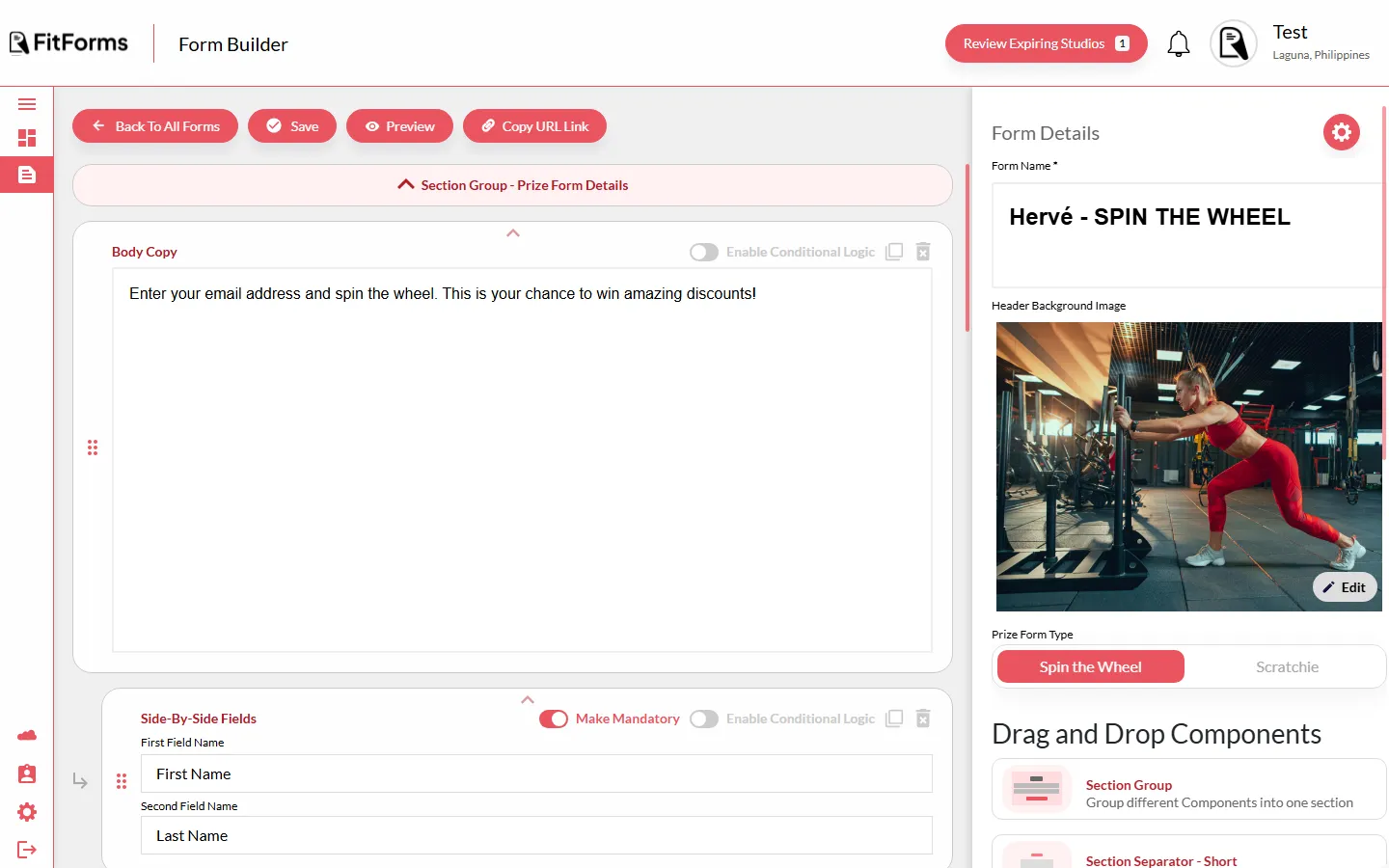
The same editor, whatever you were making
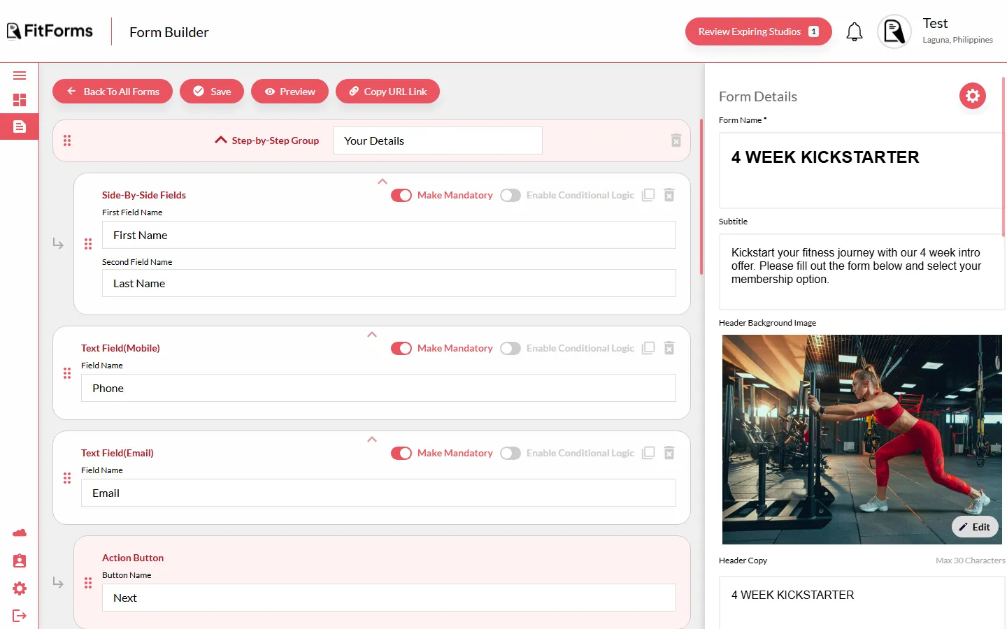
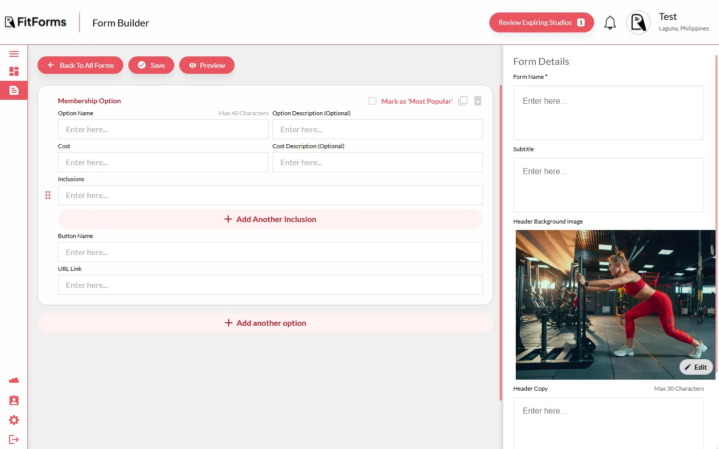
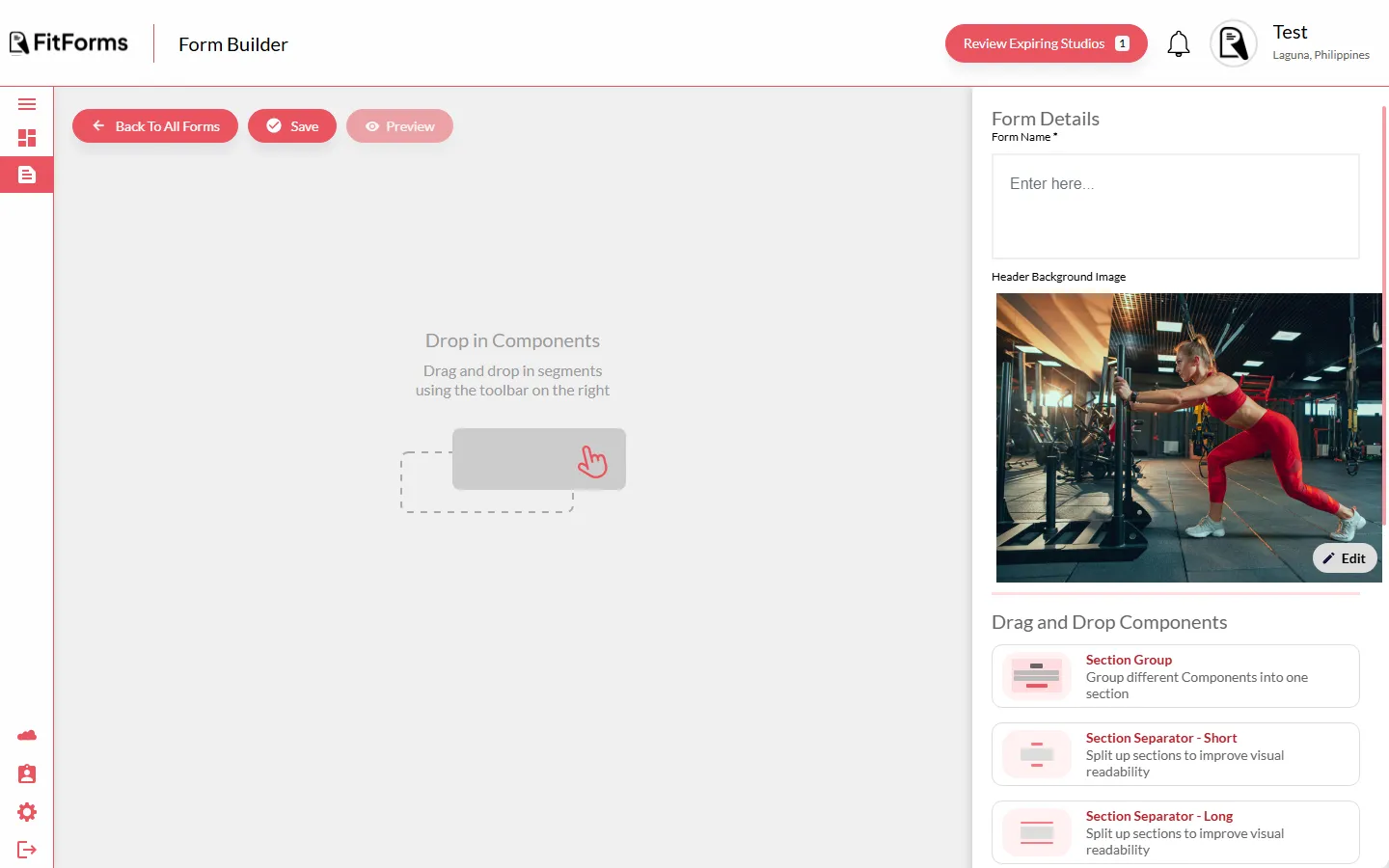
- One editor for everything. Nothing felt like what it actually was.
- No live preview. You set things up and hoped, then left the editor to see the result.
- No real controls. Prize odds, plan tiers and locked links were faked with text fields.
- Loud red everywhere that read as a cheap widget, not a premium platform.
Prize, a game not a form
A spin-the-wheel or scratch card that turns a cold visitor into a lead in one tap.
Gyms care about margin, meaning how often they give away a free month. In V1 the odds were guesswork typed into a box. Here the wheel runs on real weighted prizes and the reveal is tactile, so the prize feels earned and the email feels like a fair trade. Colours default to the studio brand theme, and a per-campaign override runs a live contrast check so a custom look can never turn unreadable.
Membership, a pricing page that converts
Plans became real, structured objects instead of loose text, so the member page can guide the choice.
Because a plan is now real fields, price, period, features, and a single popular flag, the member page can apply proven pricing patterns on its own: one emphasised tier, aligned feature lists, one clear button. A non-designer owner ships a page that follows best practice by default.
Links, the front door from social
One link-in-bio page of typed blocks, including links that stay locked behind a PIN for members only.
The bio page is the front door from Instagram and TikTok. Blocks are typed, a link tile, a file, an image, a video, so a locked members-only tile is a real capability the owner switches on with no code. It routes traffic to their other FitForms campaigns and reads as their brand, not a generic link list.
Working inside the system
I did not author the design system. The craft was applying it across three complex surfaces without inventing anything new.
Mobile, where members really are
What I would carry forward
It’s built and on track to ship; it just isn’t public yet, so these are the calls I’d defend, not launch metrics I can’t honestly claim.
The bet I’d stake the most on is making every builder render the real member page as you edit it; collapsing “build” and “see” into one screen is what makes these surfaces feel worth a premium, and it held up across all three. The day it’s live, the first thing I’ll test is whether owners trust the odds and pricing controls enough to tune them, or just ship the defaults; that’s the line between a platform that feels premium and one that only looks it.
Sent — thanks, I'll write back soon.