The desktop was only half the product
My job — translate desktop FitForms to mobile, not shrink it. I triaged what earns a place on a phone, then rebuilt the nav, inbox, and Canva-style form builder to feel native in the hand.
- Role
- UI/UX Designer
- Timeline
- Apr to Jul 2026
- Team
- 1 Product Manager + 1 Designer (me)
Translating desktop to mobile isn’t shrinking; it’s deciding what a phone is actually for, then redesigning those few things to feel native, not ported.
I scoped mobile with a triage matrix: triage, respond, search and light building earn the phone; deep configuration stays on desktop. Then I rebuilt the sidebar into a bottom-tab model, the table into a triage-signal inbox, and the desktop Canva-style editor into a live-form canvas you edit by touch. Three pieces below are pulled out live: the triage matrix, the triage signal, and the search bar with its edge cases.
It already ran on a phone. That was the problem.
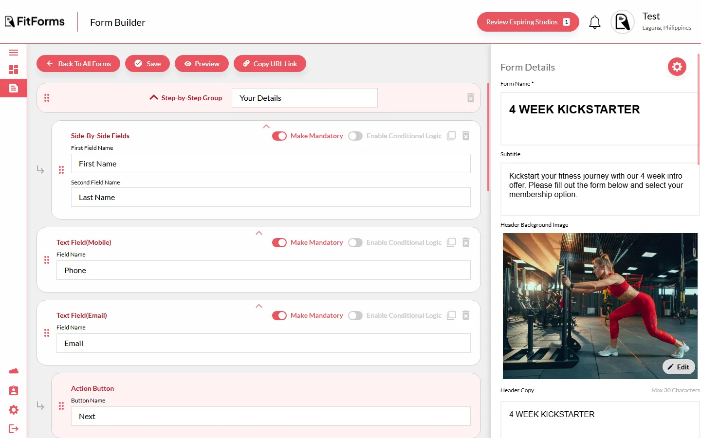
It already opened on a phone, as a desktop app squeezed until it fit, that broke the moment you tried to do anything.
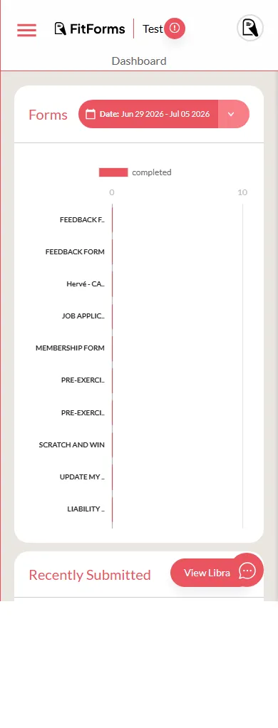
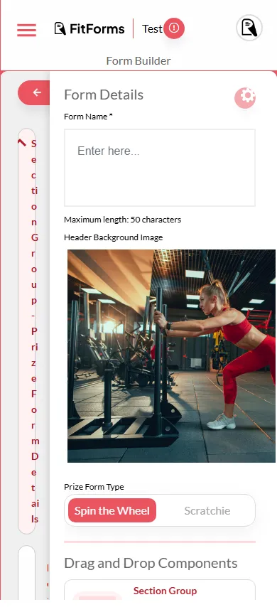
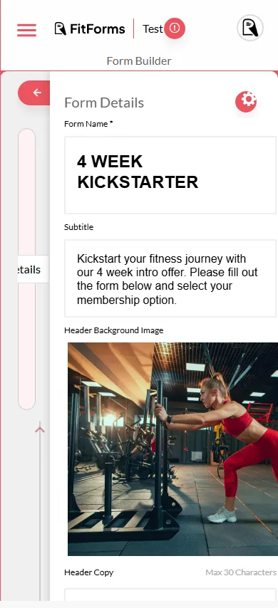
- A hamburger hiding a desktop sidebar. The primary navigation was two taps and a mental map away.
- Panels that collapsed into vertical text. “Section Group” ran down the screen one letter at a time.
- The builder was a scrolling form of settings. Nothing you could see was the thing you were making.
- No sense of touch. Hit targets, gestures and reachability were whatever the desktop happened to leave behind.
The same product, rebuilt as a native app you run with one hand. Every screen below is the real thing, captured from the working build.
Triage on the floor
Before drawing a screen, I decided what a phone is for. An owner between classes needs a different product than one at a desk.
I sorted every desktop feature against one question: is this something you do on the floor, in the gaps of a working day? The things you do standing up (check who came in, reply, look someone up, tweak a live form) became the mobile floor. The things you do sitting down once a quarter (wire up Mindbody, change billing, manage the team) stayed on desktop, where width and focus actually help. “Both” was a deliberate answer too, not a cop-out: pick an accent on your phone, fine-tune the system later.
From a sidebar to a thumb
Nine sidebar destinations became five bottom tabs plus a floating Create button. Everything else was demoted or moved to desktop.
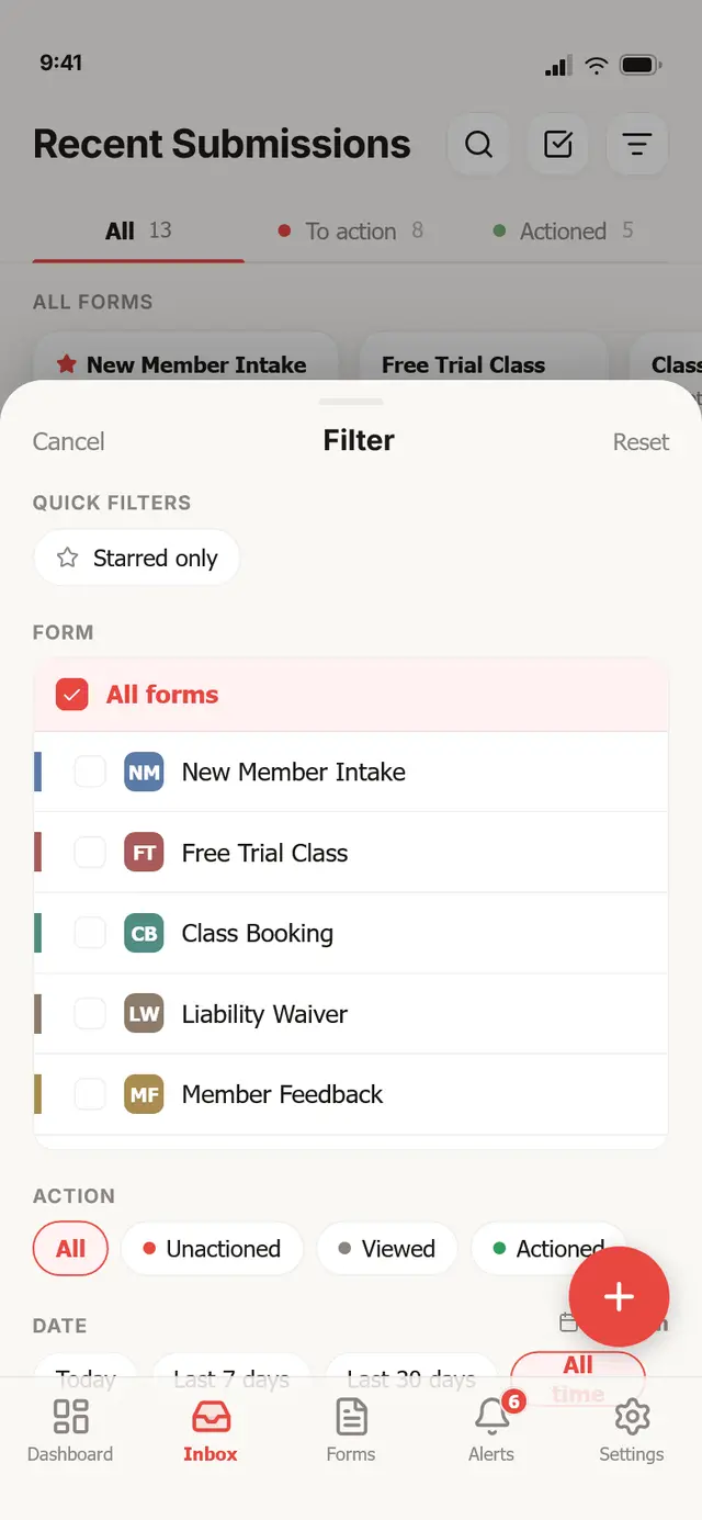
The five tabs are the destinations you return to constantly; Create is a floating button rather than a tab, because starting a form is the app’s whole reason to exist and it should be one thumb-tap from anywhere. In-screen actions (search, filter, back) live in iOS-style glass pills at the top, where a thumb can reach them without hunting. The desktop’s rarer destinations didn’t get a cramped home on mobile; they got an honest one on desktop.
One question per row: does this need me?
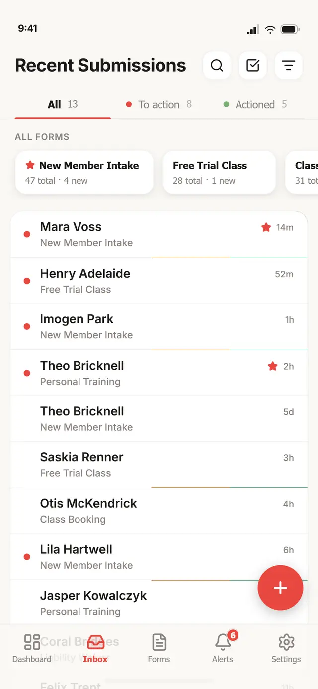
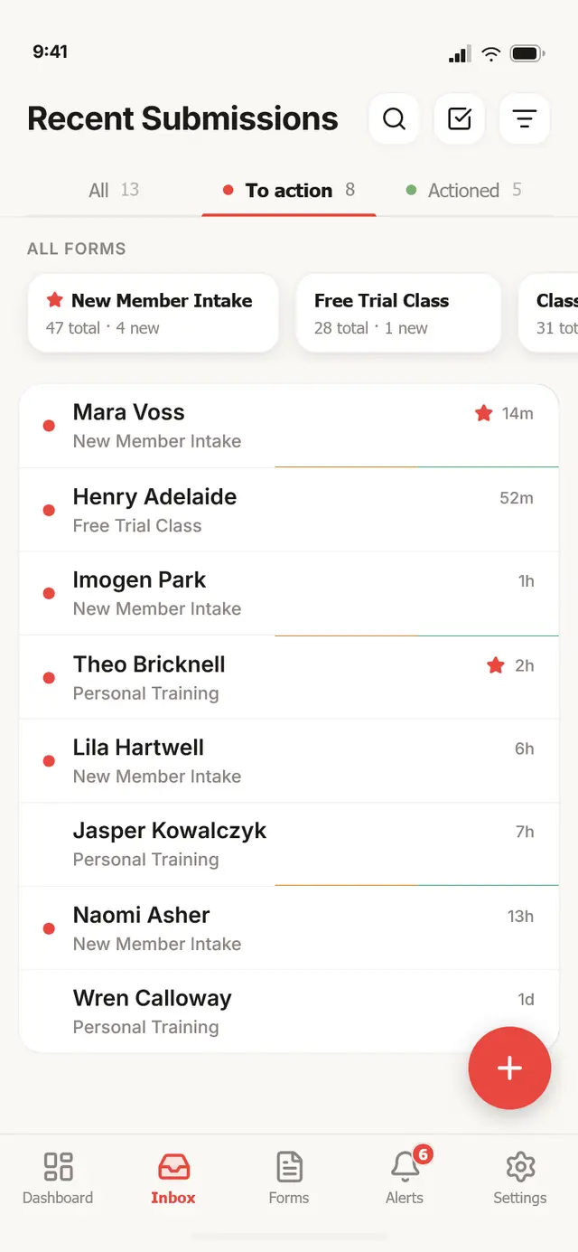
On a phone, one question matters: does this one need me? So the inbox is built around a three-state triage signal.
Unactioned. A red dot means it still needs a human; the inbox surfaces these first.
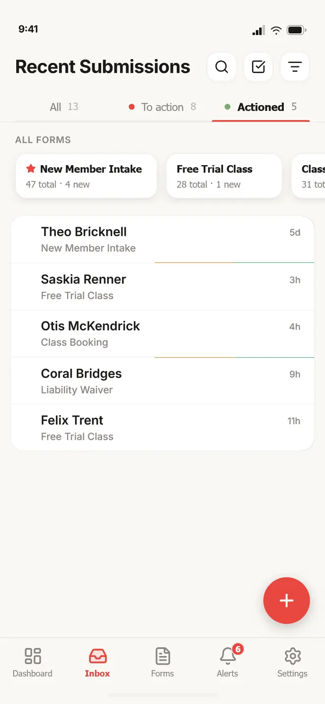
The signal has exactly three states: unactioned needs a reply, viewed means someone opened it but didn’t act, actioned is done. It’s the same object everywhere: in the row, in the count-tabs at the top of the inbox, and in the header of the detail screen. Below it, submissions swipe to advance their state, so clearing the queue is a thumb flick, not a trip into a menu. Everything else on the row (the form, the age, a teammate’s “viewing now” pip) is secondary to that one dot.
One submission, full screen
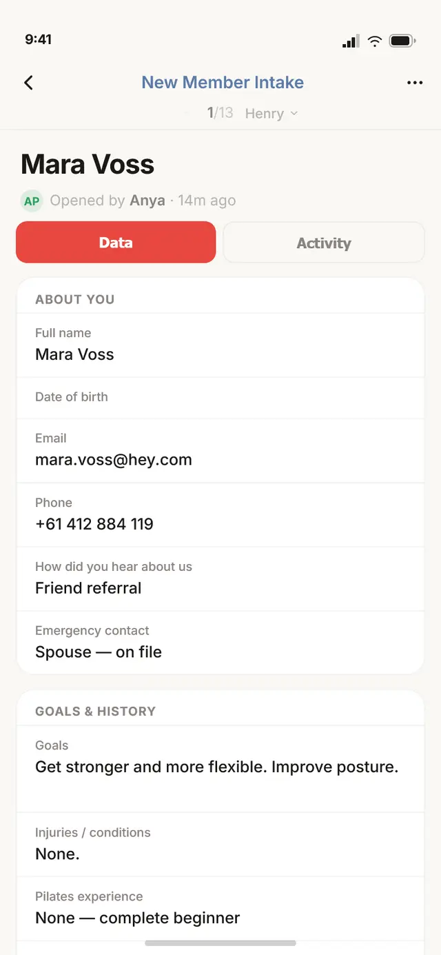
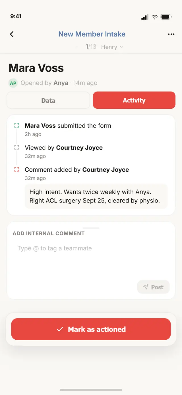
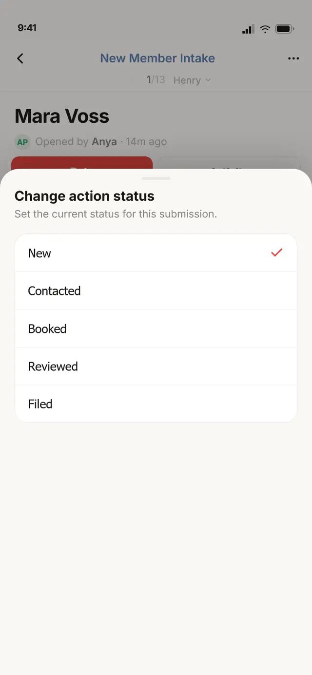
Detail goes full-screen, and the list becomes a gesture: swipe to the next person without going back.
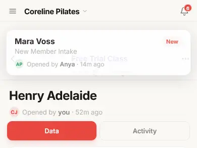
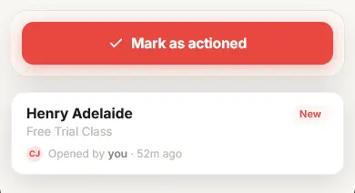
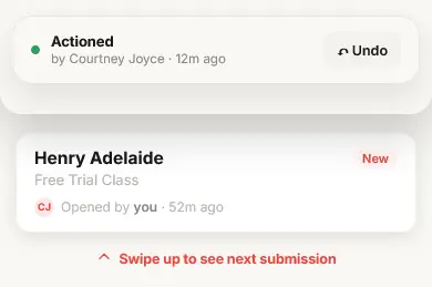
The sticky footer speaks the form’s own language (a class booking gets “Mark as confirmed,” a waiver gets “Mark as received”), so the action always matches the job. Marking one actioned plays a small celebrate moment and parks the card at the bottom of the screen, with undo one tap away, so a mistaken swipe is never destructive. The swipe between submissions locks to a single axis once it commits, and resists at the first and last record so you always feel the edge of the list.
The builder was the hard part. I kept all of it.
The builder is a design tool, a canvas of the real form. The hard part: keeping that Canva-like directness with room for only one panel at a time.
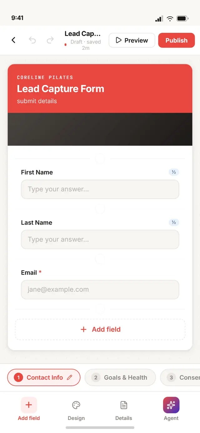
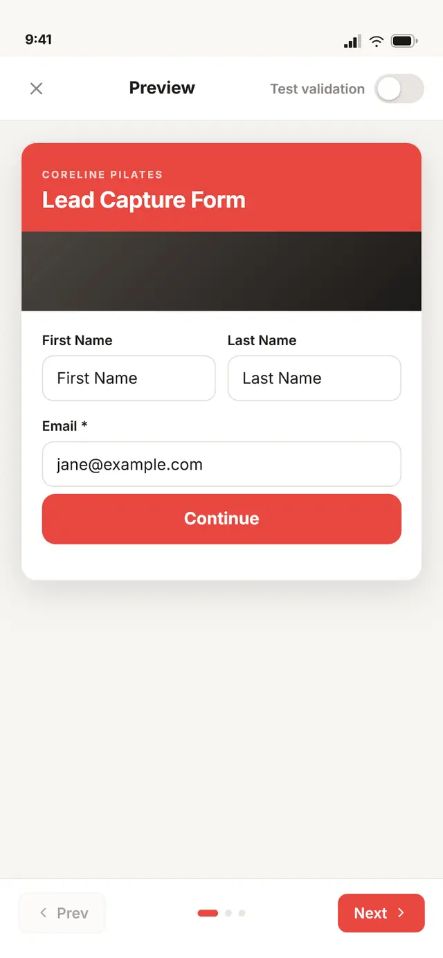
Instead of splitting build and preview into separate modes, the canvas is the member-facing form the whole time; editing happens directly on it, and heavier controls are summoned as bottom sheets only when you need them. The field editor keeps all three desktop capabilities: General, a real Logic tab (show-this-field-when conditions, with operators that change by field type), and per-field Design overrides. Even conditional logic, the thing you’d expect to drop on mobile, survived intact, because it’s the reason the builder is worth more than a form of settings.
Three ways to start
Create is one tap: describe it to the Agent, start from a template, or open a blank canvas.
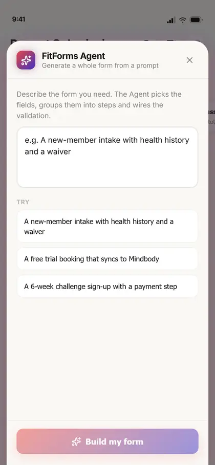
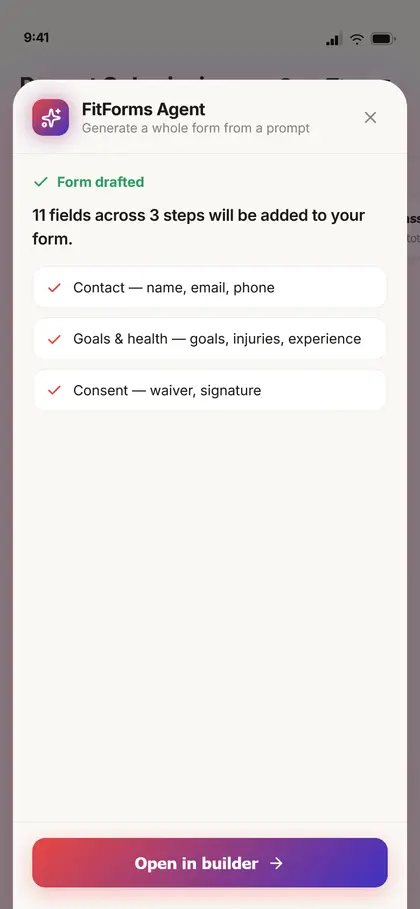
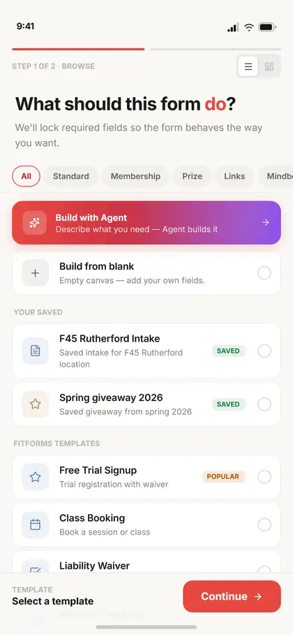
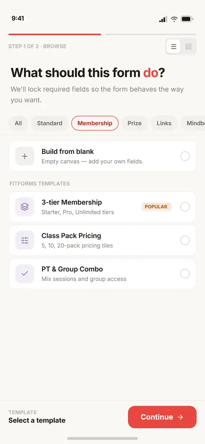
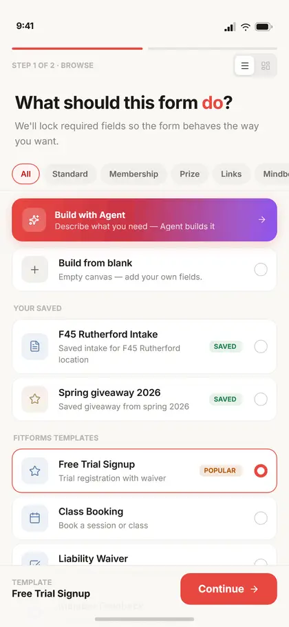
The template gallery carries the same categories as desktop, but reflowed for the phone with a filter row and an Agent card pinned to the top, because on a phone, describing what you want is often faster than scrolling a grid. Whatever path you choose, they all land in the same canvas, so there’s one builder to learn, not three.
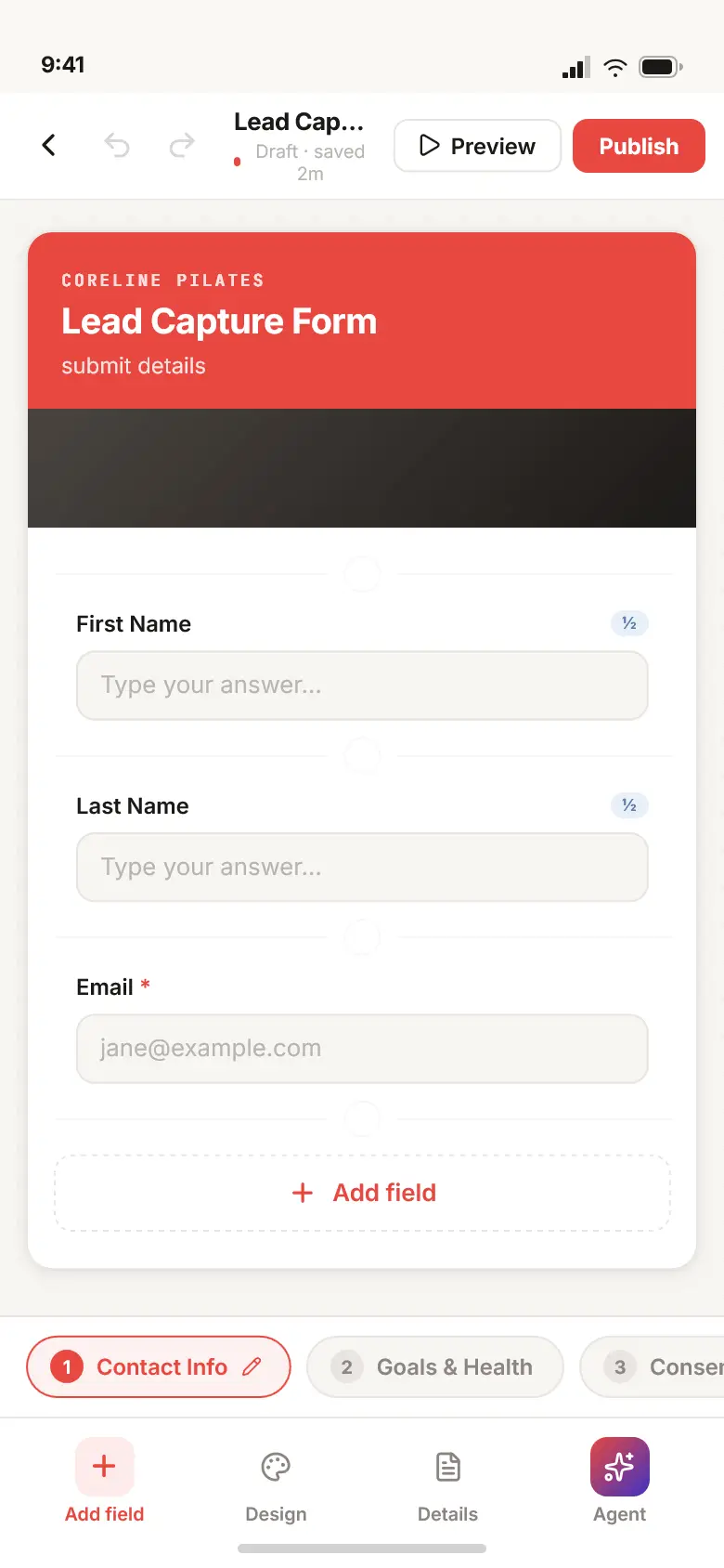
one builder to learn, not three (・‿・)
A search bar is judged by how it fails
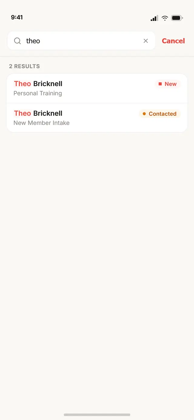
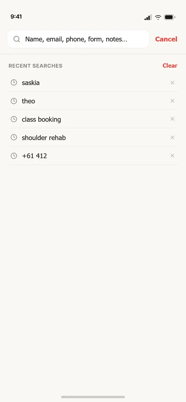
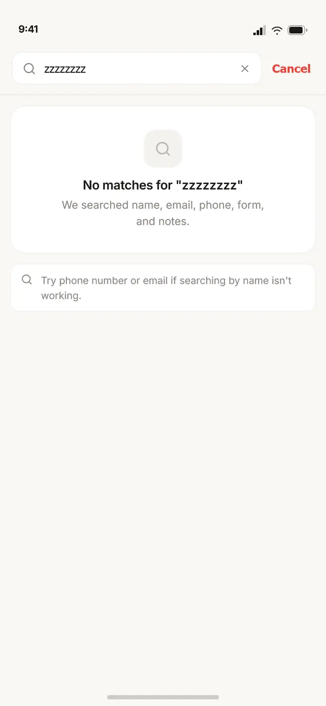
You look someone up mid-conversation, half-remembering their name. So search spans name, email, phone, form and notes, and tells you what to try when it finds nothing.
- Phone numbers normalise. Typing
+61412matches+61 412 884 119; separators are stripped on both sides, and the highlight still lands on the formatted digits. - Results show why they matched. A hit in a note or a form surfaces a labelled excerpt with the term highlighted, not just the name.
- Empty is two-tier. First the plain “no matches”, then contextual nudges: which fields were searched, “try phone or email”, and a special hint when your query looks like a phone number.
- Recents remember. A completed search is saved, de-duplicated, capped, and each entry can be removed one at a time or cleared at once.
Native, but still the same system
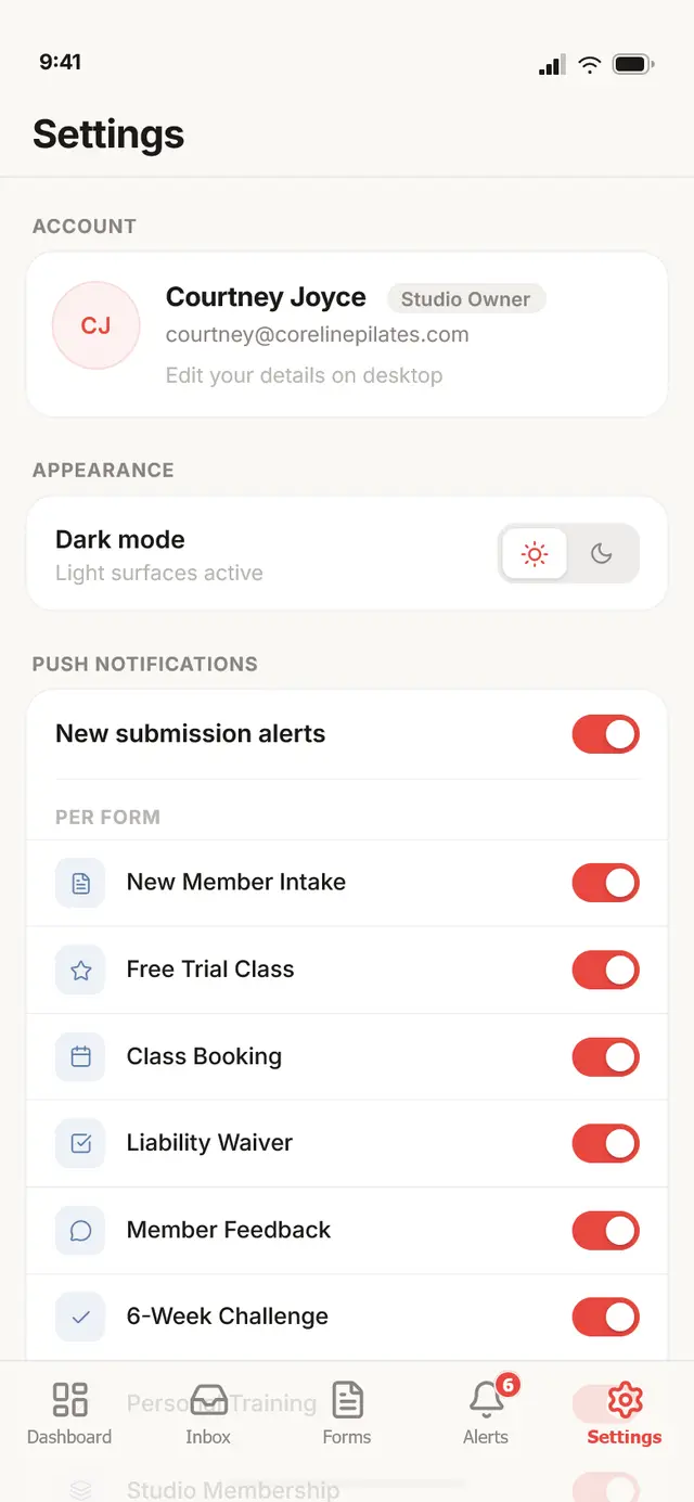
Everything reads as iOS and as FitForms at once: native conventions carry the interaction, the v2 system carries the brand. No new tokens.
Pick an accent on the floor; wire the whole system at a desk. So the phone carries a real editor, with one guardrail: contrast is checked live, as you pick.
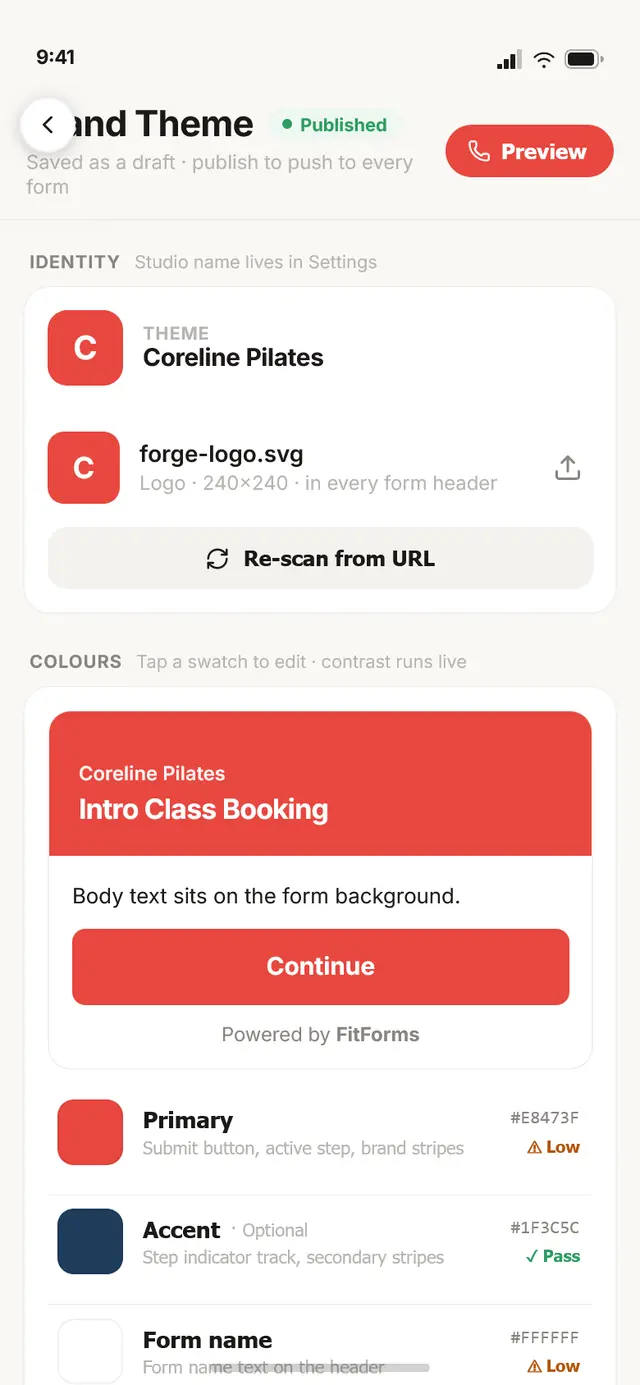
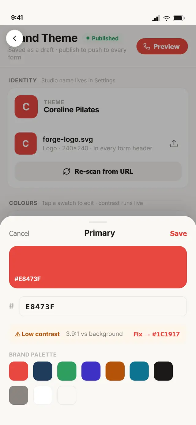
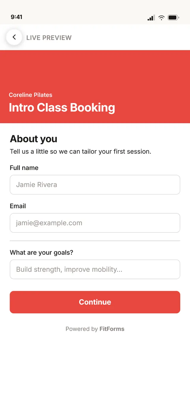
On a phone, in daylight, between classes, it’s easy to pick a brand colour that looks fine on your screen and fails for a member on theirs. So the colour editor runs a WCAG contrast ratio the moment you choose, and if it’s under bar, it doesn’t just warn, it offers the nearest accessible value as a one-tap fix. It’s the small kind of guardrail that keeps a fast, on-the-floor edit from quietly shipping an unreadable form.
The other half of the product
What I'd carry forward
The build is done and on track to ship, just not public yet, so these are convictions I’ll stand behind, not launch metrics I’d invent.
The decision I’m surest of is triaging before designing; naming the mobile floor up front is the reason this became a native app instead of a shrunk-down desktop. The bet I’ll defend hardest is the canvas builder: keeping build and preview as one surface is what makes a phone feel like the real product, not a companion to it. And the search empty-states are the detail I’d point a skeptic to first, because handling failure well is what earns trust on the floor. The day it launches, the numbers I’ll watch are whether owners actually build on their phones and whether triage between classes gets faster; until then, I’m accountable to the reasoning, and the reasoning holds.
Sent — thanks, I'll write back soon.